The Problem
CNBC worked closely with noted design agency Code and Theory on a complete redesign of CNBC.com. Analytics indicated that users were engaging with the homepage and market section but activity dropped off significantly in the section landers. It was determined that the section landers needed to be redesigned to provide more value for editorial and advertising partners.

Team and Role
I worked as part of a UX team that consisted of a Product Lead Designer and two UX researchers. I worked closely with the Product Lead on information architecture, user task flows, interaction, visual design, and prototyping. We collaborated with the UX research team to gather intelligence with analytics, user interviews, observation, and participatory design in order to understand and interpret user behavior and attitudes.
The Design Process
Readers were spending no more than one or two clicks on the landing section. Pathing flows and Adobe analytics confirmed these findings. Our first assumption was that users were there to scan headlines and then move on to other sections of the site. A small user observation test found that users moved organically through the section lander rather than use navigation. Users also did not engage with content that was arranged by topic.

The next step was a competitive analysis of other news websites. The majority of landing pages followed a similar pattern with lede stories inhabiting the upper quadrant of the page followed by a few modules trickling into a river of stories towards the bottom of the page.

The Idea
Section landing pages should be simple so users can easily scan headlines but still serve editors' need for flexibility. We arrived at the idea of compartmentalizing content into modules or zones. Following our series of sketches, we found that it was time to mock up several ideas of how the zones should look.
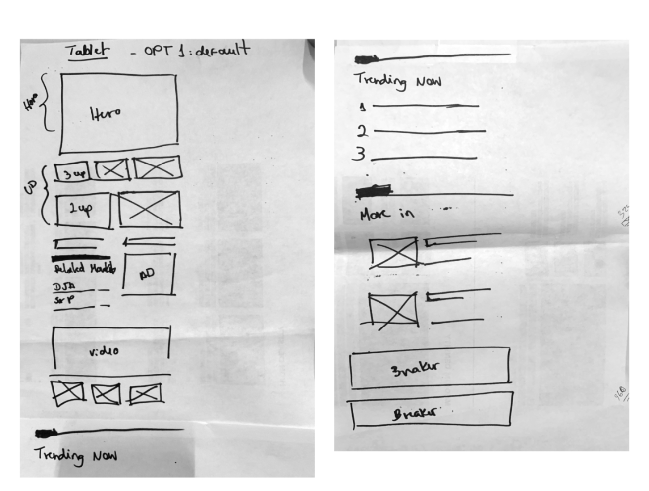
We iterated multiple versions of each zone based on information density. Next, we created a participatory design exercise that allowed members of the editorial team to create mockups for the section landers using paper cutouts. This concept was able to meet editors’ needs by being flexible enough to enable the creation of distinct looks with minimal effort.


The Outcome
By establishing a clearer hierarchy on the site that was easy to scan headlines, along with engaging hero treatments and wayfinding design, we created a seamless cross-platform experience that opens new possibilities for editors and advertisers alike.
